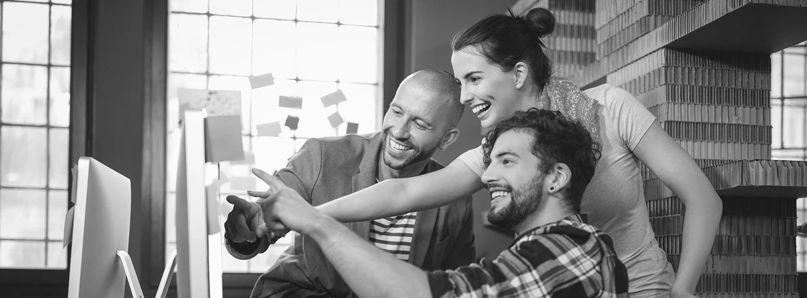
The development of web technologies, changes in user expectations, and increased competition have made website design an important element of brand identity and user experience. Every interaction, from the first page load to each click or scroll, shapes how users perceive a brand and leaves a lasting impression.
Current trends show that web designers must carefully balance aesthetics, functionality, and emotional resonance. Modern websites combine intuitive navigation, interactive features, and visual sophistication, where every detail, from typography and color to animation and layout, helps define the brand’s tone and personality while creating a memorable and cohesive user experience.
Emotional Web Design
Websites that embrace emotional design create a deeper connection with users by reflecting the brand’s personality and values through every element. Instead of relying on generic stock photography and standardized components, designers use real portraits, authentic lifestyle imagery, and personalized content that convey honesty and character. Micro-animations, such as subtle button pulses, smooth section transitions, or scroll-triggered effects, add dynamism and vitality. This approach enhances engagement, as users instinctively respond to visual and emotional cues, building trust and loyalty. Every visual and interactive detail is thoughtfully crafted to express the brand’s tone, mood, and identity, creating an experience that users remember and want to revisit.
Dark Mode and Dynamic Color Palettes
Dark mode and carefully curated color palettes have become essential components of modern web design. Dark themes reduce visual strain and improve readability, especially during extended use, while dynamic color palettes help highlight key elements and guide user attention through contrast and tone. Well-balanced color combinations reinforce brand identity, set the emotional tone of the website, and create a cohesive visual impression. This approach combines aesthetics with functionality, improving content clarity and focus while maintaining a sophisticated and appealing appearance.
Minimalism with Character
Minimalism in web design merges simplicity with a distinct visual identity. Negative space is used strategically to guide the user’s focus and establish a natural rhythm across the page, while subtle transitions, micro-details, and textures add depth and refinement. Colors are selected to emphasize brand recognition and introduce warmth into the design, while a limited palette and restrained typography reinforce balance and clarity. This minimalist approach allows for intuitive content consumption without visual clutter, as every element contributes to visual harmony and an engaging, polished aesthetic. Achieving such balance requires precise planning and thoughtful hierarchy to keep the interface clean, functional, and visually compelling.
Brutalism with Character
Brutalist web design expresses boldness and individuality. Intentionally raw elements, asymmetrical layouts, and unconventional navigation create a memorable visual identity that stands apart from standardized design patterns. This approach challenges user expectations, captures attention, and encourages interaction. Brutalism helps brands distinguish themselves in a digital landscape dominated by uniformity, every design choice, from typography to layout, communicates confidence and distinctiveness. It’s an effective strategy for projects that aim to leave a strong and lasting impression, turning web design into a tool of creative expression.
Typographic Experimentation and Expression
Typography plays a defining role in modern web design trends. The focus is on using one or, at most, two font families to maintain elegance, clarity, and cohesion. Variable font sizes establish a clear content hierarchy, guiding users naturally through the page. Larger headings attract attention, while smaller text remains easy to read and visually balanced. Designers place great emphasis on text spacing — including line height and letter spacing, to ensure readability and comfort. Subtle animated or interactive text effects are used sparingly to emphasize key messages or interactive elements, adding liveliness and a contemporary aesthetic without disrupting the overall flow.
High-Resolution and Full-Width Design
Wide layouts and high-resolution visuals create an immersive sense of scale and openness. Images, videos, and hero sections often extend across the full width of the screen, while flexible grid systems maintain balance and legibility. This design trend emphasizes premium quality, draws focus to key information, and offers space for creative visual exploration. Implementing full-width layouts requires careful balancing of performance and visual hierarchy to ensure the website remains fast, responsive, and aesthetically impressive on all devices.
Subtle Animations and GSAP
Among the most notable new trends in web design, subtle animations have emerged as a defining feature, bringing motion and sophistication without compromising clarity. Instead of flashy or exaggerated effects, designers now favor refined, purposeful movements that highlight functionality and content hierarchy. Hover effects, micro scroll motions, and gentle section transitions create a smooth, natural flow, helping users understand page structure intuitively. GSAP (GreenSock Animation Platform) enables precise control, synchronization, and performance optimization for complex animations that remain fluid across all devices. This trend emphasizes technical refinement and visual finesse, making websites feel modern, polished, and dynamic without introducing unnecessary visual noise.
Learn more about our approach to web design and how we transform ideas into digital experiences at Lupus Art – Web Design
 Web Technologies
 Web Redesign
 Web Technologies